Building a Desktop UI for alfaclub.app without breaking mobile
How I added a desktop shell on top of a mobile-first Next.js 15 PWA. Route groups, parallel route slots, the device-class cookie, and the slot decisions that actually stuck.
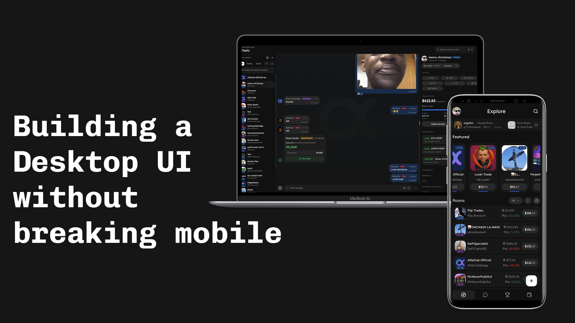
How I added a desktop UI to alfaclub.app (formerly Friendspace) on top of an existing mobile-first PWA. Stack: Next.js 15 App Router, React 19, Tailwind 4, shadcn primitives, Privy, Zustand, TanStack Query.
Prefer to see it first? Jump to the live demos at the bottom (mobile + desktop walkthroughs).
Why we are doing this at all
Early on, every device got the mobile-first design because we were time-constrained. Desktop users saw the phone layout stretched out. Nothing broken, just not a desktop product. Traffic data later showed a real share of active users were on laptops, which is what unblocked actually building this.
The constraints:
- Below the breakpoint, nothing changes. Mobile shell is extracted as-is.
- Above the breakpoint, render a real desktop UI (threshold:
lg/ 1024px). Different chrome, different layout. - Same URL on both.
/rooms/abcopens the same room either way.
Responsive CSS does not bridge this gap. The shell is different (icon rail + topbar + persistent rails vs top bar + bottom nav), the components are different (a chat room can live next to a persistent right rail on desktop that does not exist on mobile), and the persistent context the desktop affords (a rooms list panel that stays visible while you click between rooms) is not something a media query can produce.
Next.js earns its keep here: the App Router exposes parallel route slots as a first-class file-system feature, so each rail becomes a @left / @right folder, SSR'd alongside the page with no orchestration on our side. That removes the biggest implementation cost.
Split into route groups, not root-layout branching
First instinct: read the cookie in the root layout, render the right shell. The problem is App Router does not tell the root layout which route group the current request is in, so it can not skip the shell for auth screens.
The fix is two route groups owning their own layouts:
app/
├── layout.tsx          # providers, fonts, html/body. NO shell logic.
├── (shell)/
│   └── layout.tsx      # picks DesktopShell vs MobileShell from a cookie
└── (full-page)/
└── layout.tsx # bare wrapper for login / invite / shareThe shell picker itself is small:
// app/(shell)/layout.tsx
export default async function ShellLayout({ children, right, left }) {
  const deviceClass = await getDeviceClass();
  if (deviceClass !== "desktop") return <MobileShell>{children}</MobileShell>;

  const defaultRightRailSize = await getRightRailSize();
  return (
    <DesktopShell
      left={left}
      right={right}
      defaultRightRailSize={defaultRightRailSize}
    >
      {children}
    </DesktopShell>
  );
}right and left are parallel route slots; more on those in the slot mechanisms section below.
The device-class cookie
The device class has to be known on the server before the first byte goes out, otherwise the user sees a flash of the wrong shell. The browser does not send viewport width, so we guess and let the client correct.
// src/lib/device-class.ts
export const DEVICE_CLASS_COOKIE = "device-class";
export const DEVICE_CLASS_OVERRIDE_COOKIE = "device-class-override";

export function detectDeviceClass(input: {
  overrideValue?: string | null;
  cookieValue?: string | null;
  secChUaMobile?: string | null;
  userAgent?: string | null;
}): DeviceClass {
  if (input.overrideValue === "mobile" || input.overrideValue === "desktop") {
    return input.overrideValue;
  }
  if (input.cookieValue === "mobile" || input.cookieValue === "desktop") {
    return input.cookieValue;
  }
  if (input.secChUaMobile === "?1") return "mobile";
  if (input.secChUaMobile === "?0") return "desktop";

  const ua = input.userAgent ?? "";
  if (/Mobi|iPhone|Android(?!.*Tablet)|webOS|BlackBerry|IEMobile/i.test(ua)) {
    return "mobile";
  }
  return "desktop";
}Order matters: override beats stored cookie beats Sec-CH-UA-Mobile beats the UA regex. The middleware runs this on every protected request and rewrites the cookie if it changed, so subsequent requests skip the regex entirely. A ?desktop=0|1|auto URL param flips the override and is the escape hatch users actually reach for (iPad portrait reports as Macintosh and gets misclassified; the override is the fix until I wire up Sec-CH-UA-Platform).
Two slot mechanisms, on purpose: parallel routes for rails, context for topbar
The rails per route (/rooms -> rooms list + room info rail, /explore -> trending rail, etc.) need SSR. The topbar pieces do not. So they use different mechanisms:
- Rails (
@left,@right) are Next.js parallel route slots. File-system-owned, SSR'd alongside the page. - Topbar pieces (
topbarTitle,topbarEyebrow,topbarRight) go through a slot context (DesktopSlotsProvider+useDesktopSlot).
The rail file tree:
app/(shell)/
├── @left/
│   ├── [...catchAll]/page.tsx     # returns null
│   ├── default.tsx
│   └── rooms/...
├── @right/
│   ├── [...catchAll]/page.tsx     # returns null
│   ├── default.tsx
│   ├── explore/page.tsx
│   ├── leaderboard/page.tsx
│   └── rooms/[roomId]/page.tsx
└── default.tsxThree gotchas, in order of how long they cost me:
Soft navigations need a [...catchAll] sibling that returns null. Without it, navigating /rooms/123 -> /explore retains the previous slot.
Hard navigations need default.tsx at every level, both for the slot (@right/default.tsx) and for the implicit children ((shell)/default.tsx). Missing it throws on hard nav.
Do not gate rail visibility on useSelectedLayoutSegment("right"). The [...catchAll] sibling sometimes wins the segment lookup over a nested dynamic page. Use pathname instead:
// src/lib/right-rail-routes.ts
const ROOT_SEGMENTS_WITH_RAIL: ReadonlySet<string> = new Set([
  "explore",
  "leaderboard",
]);
const ROOMS_RESERVED_CHILD_SEGMENTS: ReadonlySet<string> = new Set(["create"]);

export function hasRightRailForPath(pathname: string): boolean {
  const [top, child] = pathname.split("/").filter(Boolean);
  if (!top) return false;
  if (ROOT_SEGMENTS_WITH_RAIL.has(top)) return true;
  if (top === "rooms")
    return child != null && !ROOMS_RESERVED_CHILD_SEGMENTS.has(child);
  return false;
}The right rail is a percentage, not pixels
Resizable rail, persisted width. The cookie write lives on the resize callback:
const persistRightRailSize = useCallback((layout: Layout) => {
  const size = layout[RIGHT_RAIL_PANEL_ID];
  if (typeof size !== "number" || !Number.isFinite(size)) return;
  document.cookie = `${RIGHT_RAIL_COOKIE}=${size.toFixed(2)}; path=/; max-age=${RIGHT_RAIL_COOKIE_MAX_AGE}; samesite=lax`;
}, []);

const handleLayoutChanged = useDebounceCallback(persistRightRailSize, 300);Cookies, not localStorage: the server needs the value during initial render so the rail comes out of SSR at the right width.
Wrinkle that cost an hour: in react-resizable-panels v4, bare numbers passed to minSize/maxSize/defaultSize are interpreted as pixels. For percentages, pass strings:
<ResizablePanel
  id={RIGHT_RAIL_PANEL_ID}
  defaultSize={`${defaultRightRailSize}%`}
  minSize={`${RIGHT_RAIL_MIN_PCT}%`}
  maxSize={`${RIGHT_RAIL_MAX_PCT}%`}
/>The left rail is not resizable; it is a fixed-width column with expanded/collapsed states from a Zustand store. Keeping it inside the main panel of the resizable group (instead of making it its own group panel) keeps the right rail's percentage math stable when the left collapses.
Topbar slot pattern
The hook is small:
export type DesktopSlotName = "topbarTitle" | "topbarEyebrow" | "topbarRight";

export function useDesktopSlot(name: DesktopSlotName, node: ReactNode | null) {
  const setSlot = useContext(DesktopSlotsContext)?.setSlot;
  useEffect(() => {
    if (!setSlot) return;
    setSlot(name, node);
    return () => setSlot(name, null);
  }, [setSlot, name, node]);
}Two deliberate things:
- No-op on mobile. Context is
nulloutsideDesktopShell, so the call site does not have to branch on device. - Memoize
nodeat the call site. Otherwise a fresh React element every render loops the effect (setSlot-> re-render -> new identity -> effect fires).
The desktop search palette
Cmd+K is a search-and-jump dialog (rooms + users), not a generic command palette. Built on Dialog + Tabs + InputGroup; we did not pull in shadcn's Command for this scope.
// src/components/search/desktop-search.tsx (excerpt)
useHotkeys(
  "mod+k",
  (e) => {
    e.preventDefault();
    setOpen((v) => !v);
  },
  { enableOnFormTags: true, enableOnContentEditable: true }
);

const [debouncedInput] = useDebounce(input, DEBOUNCE_MS);enableOnFormTags/enableOnContentEditable are explicitly on: by default react-hotkeys-hook would not fire while focus is in the chat composer, and Cmd+K should still open the palette there. Modifier signals intent.
When the input is empty, the dialog shows a recent-nav list from a Zustand store (useRecentNavStore) so a fresh open is not a blank screen.
Component reuse policy
Desktop is new chrome around the existing feature components. The chat thread, message bubble, leaderboard row, explore feed item are reused as-is. RoomsListPanel composes the same building blocks; RoomRightRail is a stack of small section components under components/desktop/rooms/room-right-rail/.
Decision rule for "variant or new component":
- Small delta -> add a variant with a force mode. If desktop differs only by spacing, density, or one swapped subcomponent, add a
varianton the shared component'scvaconfig, or adensity/compactprop. The important part is the force mode: callers should be able to passdensity="compact"explicitly to get the tight look even when auto-detection would not. That escape hatch is what lets the same component render in a narrow desktop right rail OR in a wider mobile drawer without anyone forking it. - Genuinely different layout -> new component in
components/desktop/<feature>/. Different empty state, reordered sections, different data shape, different mental model. The shared feature components remain the source of truth for behavior; the desktop file composes them.
Other hard rule: install missing shadcn primitives with the CLI, never hand-write. Phase 0 ran npx shadcn@latest add sidebar kbd avatar breadcrumb sheet. Hand-rolled primitives drift.
Rollout and observability
Not a cutover. Two escape hatches let a user drop back to the mobile shell instantly:
?desktop=0|1|autoURL param writes the override cookie and reloads.- The override cookie itself, also writable from a "Force desktop/mobile view" toggle in settings. Persists across sessions.
The override is checked first inside detectDeviceClass, ahead of everything else, which is what makes it a reliable escape.
Observability is one line:
// src/app/providers.tsx
Sentry.setTag("shell", deviceClass);Every existing Sentry error and perf event now slices per shell. If shell=desktop errors rise while shell=mobile stays flat, that is the revert signal. Hydration mismatches come through the standard Next.js + Sentry integration. Nothing else was added; this is a presentation-layer change and the existing coverage catches the real bugs.
Closing notes
What survived:
- Two shells, split by a
device-classcookie at(shell)/layout.tsx. Pages stay agnostic. - Parallel route slots (
@left,@right) for SSR'd rails; slot context for client-only topbar pieces. - Rail visibility from pathname, not
useSelectedLayoutSegment. - Right-rail width as a percentage in a cookie so SSR renders at the chosen width.
- Mobile components are the source of truth; desktop forks live under
components/desktop/<feature>/. - One Sentry tag (
shell) is the entire observability addition.
If you are doing something similar on Next.js App Router, the two files to read first are app/(shell)/layout.tsx (the shell picker) and src/lib/device-class.ts (the cookie + detection). Everything else is downstream of those two choices.
Live demos
What the two shells actually look like in use, or try it live at alfaclub.app.
AlfaClub mobile version
AlfaClub desktop version