モバイルを壊さずに alfaclub.app のデスクトップ UI を構築する
既存のモバイルファースト Next.js 15 PWA にデスクトップシェルを追加した方法。Route groups、parallel route slots、device-class cookie、そして実際に残ったスロット設計の判断について。
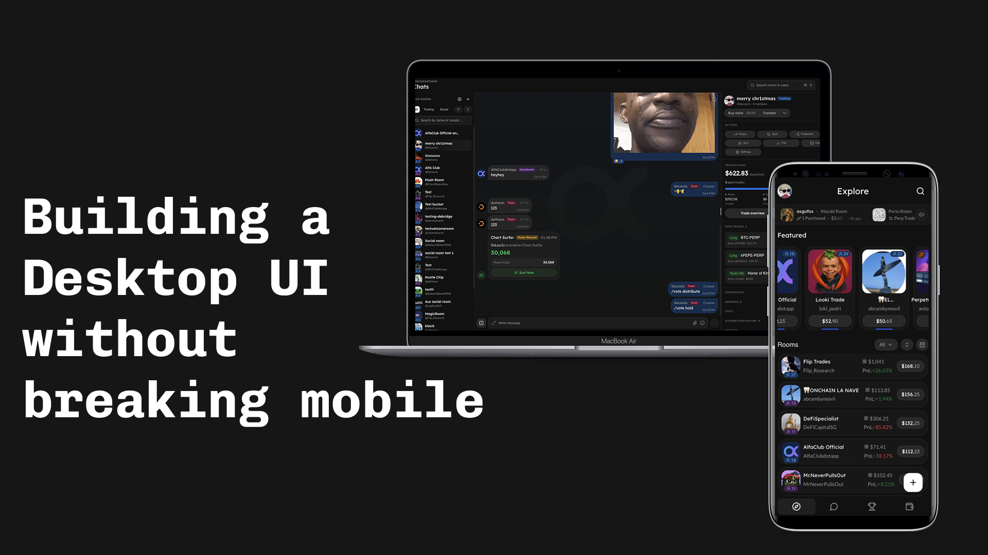
既存のモバイルファースト PWA の上に alfaclub.app(以前は Friendspace と呼んでいた)へデスクトップ UI を追加した方法。Stack: Next.js 15 App Router、React 19、Tailwind 4、shadcn primitives、Privy、Zustand、TanStack Query。
先に見たい?末尾のライブデモへジャンプ(mobile + desktop のウォークスルー)。
なぜこれをやるのか
初期はすべてのデバイスにモバイルファーストのデザインを出していた。時間がなかったからだ。デスクトップユーザーは引き伸ばされたモバイルレイアウトを見ていた。壊れてはいないが、デスクトップ製品とは言えなかった。後にトラフィックデータから、アクティブユーザーのかなりの割合がラップトップでアプリを開いていることがわかった。これがやっと意思決定のロックを外し、先送りをやめて実際にデスクトップを構築する判断につながった。
制約:
- ブレークポイント以下では何も変えない。 モバイルシェルはそのまま抽出する。
- ブレークポイント以上では本物のデスクトップ UI をレンダーする(しきい値:
lg/ 1024px)。chrome も layout も別物。 - 両方で同じ URL。
/rooms/abcはどちら側でも同じ room を開く。
レスポンシブ CSS ではこのギャップを埋められない。shell が違う(icon rail + topbar + persistent rails 対 top bar + bottom nav)、components が違う(チャットルームが desktop では persistent right rail と並んで存在できるが、mobile にはその right rail 自体がない)、そして desktop が許容する persistent context(rooms list panel が room を切り替えても見え続ける)は media query が生み出せるものではない。
ここで Next.js が真価を発揮する: App Router は parallel route slots をファイルシステムのファーストクラス feature として公開している。だから各 rail は @left / @right フォルダになり、ページと一緒に SSR される。こちらでオーケストレーションする必要がない。これが実装コストの最も大きな部分を取り除いてくれる。
root layout で分岐せず route groups で分割する
最初の直感: root layout で cookie を読み、正しい shell をレンダーする。問題は、App Router が root layout に対して現在のリクエストがどの route group にいるかを教えてくれないこと。だから auth 画面で shell をスキップできない。
修正方法は、それぞれ自分の layout を持つ 2 つの route groups:
app/
├── layout.tsx          # providers, fonts, html/body. NO shell logic.
├── (shell)/
│   └── layout.tsx      # picks DesktopShell vs MobileShell from a cookie
└── (full-page)/
└── layout.tsx # bare wrapper for login / invite / shareshell picker そのものは小さい:
// app/(shell)/layout.tsx
export default async function ShellLayout({ children, right, left }) {
  const deviceClass = await getDeviceClass();
  if (deviceClass !== "desktop") return <MobileShell>{children}</MobileShell>;

  const defaultRightRailSize = await getRightRailSize();
  return (
    <DesktopShell
      left={left}
      right={right}
      defaultRightRailSize={defaultRightRailSize}
    >
      {children}
    </DesktopShell>
  );
}right と left は parallel route slots; 詳細は下のslot メカニズムのセクションで。
device-class cookie
device class は最初のバイトが出る前にサーバー側で分かっている必要がある。そうでないとユーザーは間違った shell の flash を見る。ブラウザは viewport 幅を送ってこないので、推測してクライアント側で訂正させる。
// src/lib/device-class.ts
export const DEVICE_CLASS_COOKIE = "device-class";
export const DEVICE_CLASS_OVERRIDE_COOKIE = "device-class-override";

export function detectDeviceClass(input: {
  overrideValue?: string | null;
  cookieValue?: string | null;
  secChUaMobile?: string | null;
  userAgent?: string | null;
}): DeviceClass {
  if (input.overrideValue === "mobile" || input.overrideValue === "desktop") {
    return input.overrideValue;
  }
  if (input.cookieValue === "mobile" || input.cookieValue === "desktop") {
    return input.cookieValue;
  }
  if (input.secChUaMobile === "?1") return "mobile";
  if (input.secChUaMobile === "?0") return "desktop";

  const ua = input.userAgent ?? "";
  if (/Mobi|iPhone|Android(?!.*Tablet)|webOS|BlackBerry|IEMobile/i.test(ua)) {
    return "mobile";
  }
  return "desktop";
}順序が重要: override が保存された cookie に勝ち、Sec-CH-UA-Mobile に勝ち、UA regex に勝つ。middleware が protected な各リクエストでこれを実行し、cookie が変わっていれば書き直すので、次以降のリクエストは regex をスキップする。?desktop=0|1|auto の URL パラメータは override を切り替えるエスケープハッチで、これが実際に使われるもの(iPad の縦向きが Macintosh として報告され分類を誤るが、Sec-CH-UA-Platform を組み込むまでこの override が解決策)。
二つの slot メカニズム、意図的: parallel routes を rails へ、context を topbar へ
ルート単位の rails(/rooms -> rooms list + room info rail、/explore -> trending rail、など)は SSR が必要。topbar のピースは不要。だから別の仕組みを使う:
- Rails(
@left、@right)は Next.js の parallel route slots。ファイルシステム所有、ページと一緒に SSR される。 - Topbar のピース(
topbarTitle、topbarEyebrow、topbarRight)は slot context(DesktopSlotsProvider+useDesktopSlot)経由。
rails のファイルツリー:
app/(shell)/
├── @left/
│   ├── [...catchAll]/page.tsx     # returns null
│   ├── default.tsx
│   └── rooms/...
├── @right/
│   ├── [...catchAll]/page.tsx     # returns null
│   ├── default.tsx
│   ├── explore/page.tsx
│   ├── leaderboard/page.tsx
│   └── rooms/[roomId]/page.tsx
└── default.tsx3 つの罠、時間を取られた順:
Soft navigations では null を返す [...catchAll] の sibling が必要。 これがないと、/rooms/123 -> /explore への遷移で前の slot が残る。
Hard navigations では各レベルで default.tsx が必要。slot(@right/default.tsx)と implicit children((shell)/default.tsx)の両方。欠けると hard nav で throw する。
rail の表示判定を useSelectedLayoutSegment("right") に依存させないこと。 [...catchAll] sibling が nested dynamic page よりも segment lookup で勝つことがある。代わりに pathname を使う:
// src/lib/right-rail-routes.ts
const ROOT_SEGMENTS_WITH_RAIL: ReadonlySet<string> = new Set([
  "explore",
  "leaderboard",
]);
const ROOMS_RESERVED_CHILD_SEGMENTS: ReadonlySet<string> = new Set(["create"]);

export function hasRightRailForPath(pathname: string): boolean {
  const [top, child] = pathname.split("/").filter(Boolean);
  if (!top) return false;
  if (ROOT_SEGMENTS_WITH_RAIL.has(top)) return true;
  if (top === "rooms")
    return child != null && !ROOMS_RESERVED_CHILD_SEGMENTS.has(child);
  return false;
}right rail はピクセルではなくパーセント
リサイズ可能な rail、幅は永続化。cookie の書き込みは resize callback の中:
const persistRightRailSize = useCallback((layout: Layout) => {
  const size = layout[RIGHT_RAIL_PANEL_ID];
  if (typeof size !== "number" || !Number.isFinite(size)) return;
  document.cookie = `${RIGHT_RAIL_COOKIE}=${size.toFixed(2)}; path=/; max-age=${RIGHT_RAIL_COOKIE_MAX_AGE}; samesite=lax`;
}, []);

const handleLayoutChanged = useDebounceCallback(persistRightRailSize, 300);localStorage ではなく cookie を使う理由: 初回レンダー時にサーバーが値を読む必要があるため、rail が正しい幅で SSR から出てくる。
1 時間かかった罠: react-resizable-panels v4 では、minSize/maxSize/defaultSize に裸の数値を渡すと pixel として解釈される。パーセントを使いたければ文字列で渡す:
<ResizablePanel
  id={RIGHT_RAIL_PANEL_ID}
  defaultSize={`${defaultRightRailSize}%`}
  minSize={`${RIGHT_RAIL_MIN_PCT}%`}
  maxSize={`${RIGHT_RAIL_MAX_PCT}%`}
/>left rail はリサイズ不可。Zustand store から expanded/collapsed の状態を持つ固定幅カラム。これを resizable group の main panel の中に入れる(独立した group panel にせず)ことで、left が collapse したときに right rail のパーセント計算が安定する。
topbar slot pattern
hook は小さい:
export type DesktopSlotName = "topbarTitle" | "topbarEyebrow" | "topbarRight";

export function useDesktopSlot(name: DesktopSlotName, node: ReactNode | null) {
  const setSlot = useContext(DesktopSlotsContext)?.setSlot;
  useEffect(() => {
    if (!setSlot) return;
    setSlot(name, node);
    return () => setSlot(name, null);
  }, [setSlot, name, node]);
}意図的な 2 点:
- mobile では no-op。 context は
DesktopShellの外ではnullなので、call site はデバイスで分岐する必要がない。 - call site で
nodeをメモ化する。 さもなければ毎レンダーで新しい React element が生成され、effect がループする(setSlot-> re-render -> 新しい identity -> effect 再発火)。
デスクトップ検索パレット
Cmd+K は search-and-jump ダイアログ(rooms + users)。汎用 command palette ではない。Dialog + Tabs + InputGroup で構築。このスコープでは shadcn の Command は使わなかった。
// src/components/search/desktop-search.tsx (excerpt)
useHotkeys(
  "mod+k",
  (e) => {
    e.preventDefault();
    setOpen((v) => !v);
  },
  { enableOnFormTags: true, enableOnContentEditable: true }
);

const [debouncedInput] = useDebounce(input, DEBOUNCE_MS);enableOnFormTags/enableOnContentEditable を明示的に on: デフォルトでは react-hotkeys-hook はチャット composer にフォーカスがある間は発火しない。だが Cmd+K はそこでも palette を開いてほしい。modifier 自体が intent を示している。
input が空のとき、ダイアログは Zustand store(useRecentNavStore)から直近のナビゲーションリストを表示する。新しく開いたときに空白画面にならないため。
コンポーネント再利用ポリシー
デスクトップは既存の feature components を囲む新しい chrome。chat thread、message bubble、leaderboard row、explore feed item はそのまま再利用。RoomsListPanel は同じ building blocks を組み立て、RoomRightRail は components/desktop/rooms/room-right-rail/ 配下の小さな section components の積み重ね。
「variant か新規 component か」の判断ルール:
- 小さな差分 -> force mode 付きの variant を追加。 desktop が mobile と spacing、密度、または 1 つの subcomponent の入れ替えだけしか違わないなら、shared component の
cvaconfig にvariantを追加するか、density/compactprop を追加。重要なのは force mode: 呼び出し側がdensity="compact"を明示的に渡して、auto-detection ではそうならない場面でも tight な見た目を取れるようにすること。このエスケープハッチがあるから、同じ component を狭い desktop の right rail でも、広めの mobile drawer でも、誰も fork せずにレンダーできる。 - 本当に異なる layout ->
components/desktop/<feature>/配下の新規 component。 empty state が違う、section の順序が違う、データ形が違う、メンタルモデルが違う場合。shared feature components は依然として behavior の source of truth、desktop ファイルがそれらを組み立てる。
もう 1 つの硬いルール: 足りない shadcn primitive は CLI でインストール。手書きしない。Phase 0 では npx shadcn@latest add sidebar kbd avatar breadcrumb sheet を実行した。手書きの primitive は drift する。
ロールアウトとオブザーバビリティ
cutover ではない。ユーザーが即時に mobile shell に戻れるエスケープハッチが 2 つある:
- URL パラメータ
?desktop=0|1|autoが override cookie を書いてリロード。 - override cookie 自体、settings の「Force desktop/mobile view」トグルからも書ける。セッション間で永続化される。
override は detectDeviceClass の中で最初にチェックされ、他のすべてに先行する。これが信頼できるエスケープであり続ける理由。
オブザーバビリティは 1 行:
// src/app/providers.tsx
Sentry.setTag("shell", deviceClass);既に収集している Sentry の error と perf event がすべて shell ごとにスライスできる。shell=desktop のエラーが上がり shell=mobile がフラットならそれが revert のシグナル。Hydration mismatch は標準の Next.js + Sentry integration で来る。他には何も足していない。これはプレゼンテーションレイヤの変更で、既存のカバレッジが実際のバグを捕まえる。
終わりに
残ったもの:
- 2 つの shell、
(shell)/layout.tsxでdevice-classcookie によって分岐。pages は agnostic を維持。 - Parallel route slots(
@left、@right)は SSR される rails 用、slot context は client only な topbar ピース用。 - rail 表示判定は pathname から、
useSelectedLayoutSegmentからではない。 - right-rail 幅は cookie 内にパーセントで保存、SSR が選択された幅でレンダーするため。
- mobile components が source of truth、desktop forks は
components/desktop/<feature>/配下。 - Sentry の 1 つの tag(
shell)がオブザーバビリティ追加のすべて。
Next.js App Router で似たことをやるなら、最初に読むべき 2 ファイルは app/(shell)/layout.tsx(shell picker)と src/lib/device-class.ts(cookie + detection)。それ以外はすべてこの 2 つの選択の下流にある。
ライブデモ
2 つの shell が実際にどう動くか、または alfaclub.app でライブ試用。
AlfaClub モバイル版
AlfaClub デスクトップ版